Choosing the Right Colors for Your Bedroom: A Guide to Building a Palette You Won't Regret
BEDROOM
7/18/20264 min read
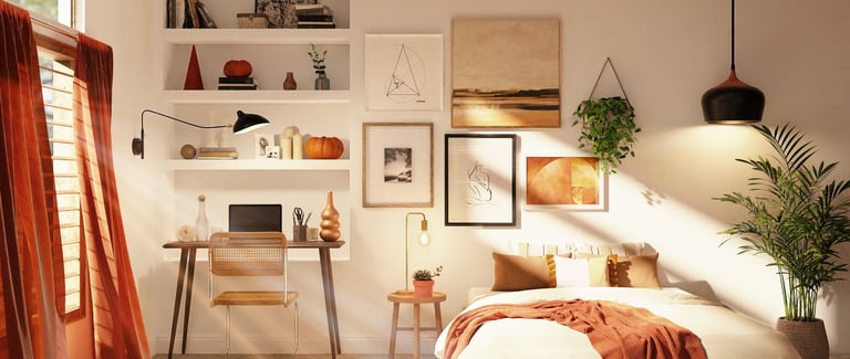
Your bedroom is the one room in the house that doesn't need to perform for anyone. No guests are grading it. No one's Instagramming your ceiling.
Which is exactly why so many people get the color wrong — they design it like a room meant to impress, instead of a room meant to hold them at the end of a long day.
A good bedroom palette isn't about finding "the perfect color." It's about building a small, disciplined system of colors that work together to do one job: help you sleep, wake up, and feel like yourself in between.
Here's how to actually do that.
Start With the Mood, Not the Paint Chip
Before you touch a single swatch, answer this: what do you want this room to feel like at 11pm and at 7am? Those are two very different jobs, and your palette has to serve both.
Cocooning and calm - muted, low-saturation colors: clay, sage, soft charcoal, dusty blue


Airy and restorative - whites, warm greiges, pale sand, blush


Moody and grounded - deep greens, ink navy, espresso brown, burgundy


Notice none of these are "exciting" colors. Bedrooms are the wrong place for a palette that shouts. Save the saturated, high-energy colors for rooms where you're awake and active.
The Three-Color Rule
Every palette that actually works in a real room, not just a moodboard, breaks down into three roles. Skip one and the room feels unfinished or chaotic.
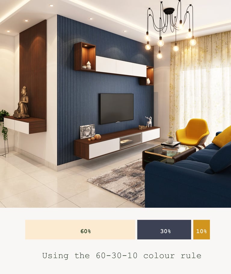
The anchor (60%) — your walls, and often your bedding. This is the color the room is "about." It should be the one you're least likely to get tired of, because it's everywhere.
The support (30%) — furniture, rugs, curtains. This is where you introduce contrast or warmth without overwhelming the anchor.
The accent (10%) — pillows, art, a lamp, a vase. This is your one permission slip to be bold. If you want a jewel tone or a print, it lives here.
If you're staring at a Pinterest board wondering why your version doesn't look like the inspiration photo, it's almost always because you copied the accent color and forgot the anchor and support were doing 90% of the work.
Undertones Are the Silent Palette-Killer
This is the part nobody warns you about: two "whites" or two "greiges" can clash badly if their undertones fight each other. A warm white (yellow or pink undertone) next to a cool white (blue or gray undertone) will look like a mistake, even though both are technically "white."
Before committing to a palette:
Hold your paint chips together in the actual room, at the actual time of day you'll mostly see them (evening light is warmer, north-facing light is cooler and flatter).
Check your existing furniture's undertones — wood floors, in particular, are rarely neutral. Most lean warm (yellow/orange) or cool (gray/ash).
Pick one undertone family and stay loyal to it across walls, textiles, and trim. This single decision prevents 80% of "why does this room feel off" problems.
Palettes That Actually Work (Copy These If You're Stuck)
If you want a starting point rather than a blank page, these combinations are reliably good in real bedrooms, not just renderings:
Warm minimalist: warm white walls, oatmeal linen bedding, walnut wood tones, one terracotta accent


Modern moody: deep forest green walls, cream bedding, black metal accents, brass lamp


Soft romantic: dusty rose walls, ivory linens, aged brass, sage green accent


Coastal calm: soft sky-blue-gray walls, white bedding, natural rattan, driftwood tones


Quiet luxury: greige walls, camel and cream layered bedding, walnut furniture, a single black accent


Each of these follows the 60/30/10 rule without you having to think about it. That's the point — a good palette should feel effortless once it's built, even though the building itself takes real thought.
What to Avoid
More than one "hero" color. If your walls, curtains, and bedspread are all competing for attention, the room will feel restless instead of restful.
Choosing colors under store lighting. Fluorescent lighting flattens undertones and lies to you. Always test at home.
Matching too perfectly. A palette where everything is exactly the same shade reads as sterile, not serene. Let your support and accent layers introduce gentle variation.
Ignoring your ceiling. It's the fifth wall, and a stark white ceiling against colored walls can make a moody palette feel unfinished. Consider a soft tint of your wall color instead.
The Real Test
Once you've picked your three, sit in the room at night with just your lamp on, and again in the morning with the curtains open. If both versions of the room still feel like they belong to the same idea, you've built a palette, not just picked some paint.
That's really the whole job: not chasing a trend, but building a small, coherent system of color that holds up in every light your bedroom will ever see.